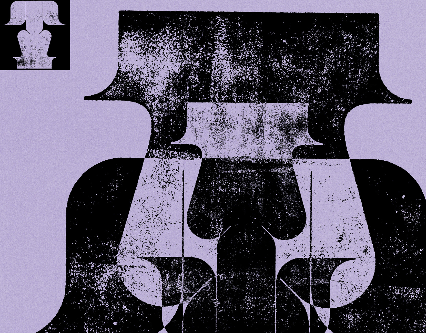
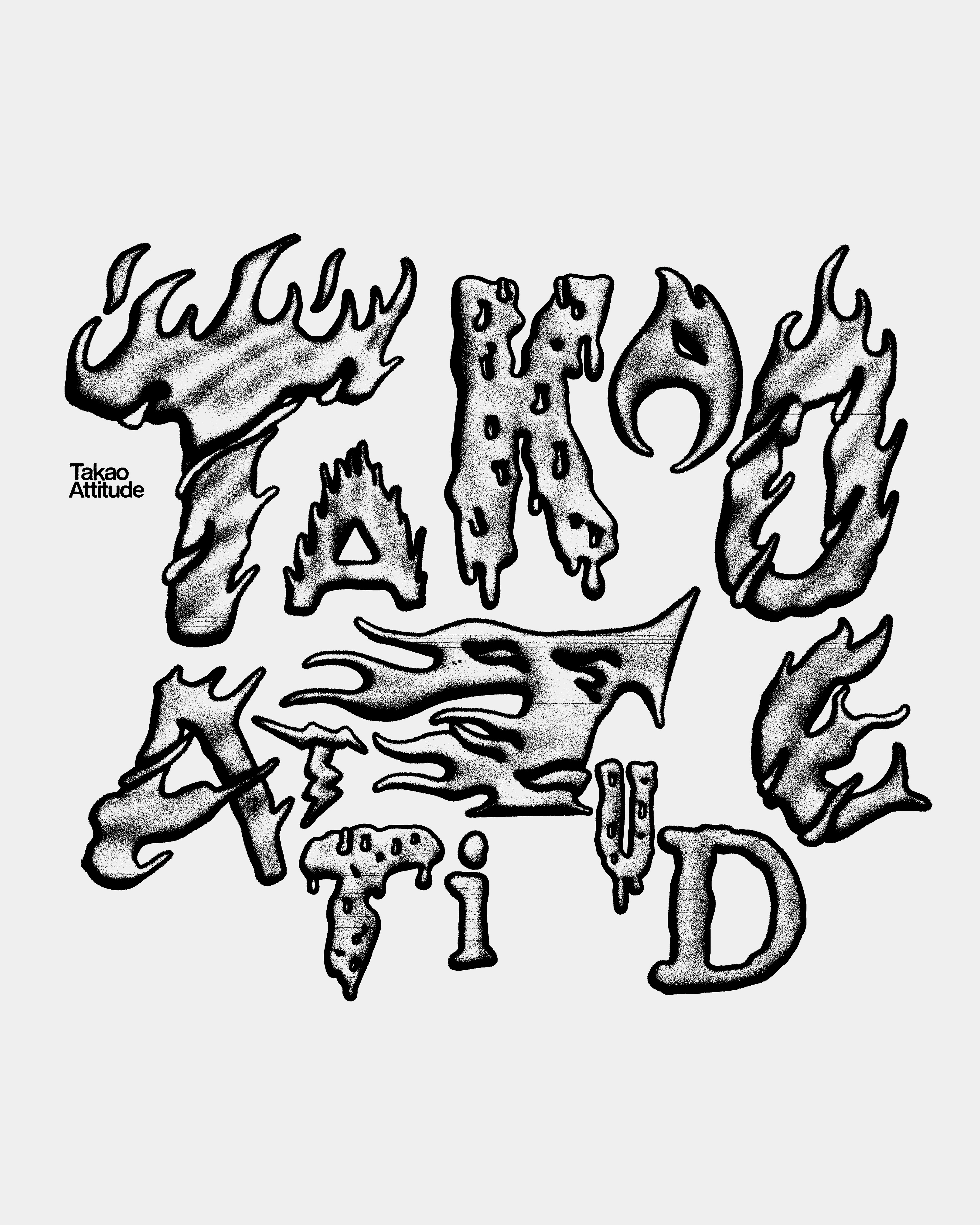
印象中的高雄,既熱情又帶著一點反骨的性格。這些特質未必張揚,但總在每次造訪這座城市時,一點一滴地發覺,彷彿在平易近人的表面下,蘊含著疾風迅雷般的能量。
如果這種態度能透過都市中的肌理來表現,我覺得就像柏油路上的標線文字——即使被烈日曬得有些融化、甚至變形斑駁,卻依舊牢牢貼附在路面上,持續發揮它的作用。
我組合了各種火焰、雷電、熔解等意象的字體,並以道路文字的質地重繪,重現這種踏實卻狂放的精神,向 Takao 那份風雨無懼、打死不退的態度致敬。
Kaohsiung, to me, is warm yet rebellious. Its energy isn’t loud, but slowly reveals itself—a quiet force beneath a friendly surface.
If this spirit were a texture, it’d be the markings on asphalt—weathered by heat, warped and cracked, yet firmly holding on, still doing their job.
I combined flame, lightning, and melting-inspired type, redrawn with the grit of street text, as a tribute to Takao’s bold, unshakable spirit.

*《高雄設計節 2025》參展作品
Year: 2025
Client: 選選研 S.SELECT LAB
Graphic design: Leo Hsieh 謝明佑
Client: 選選研 S.SELECT LAB
Graphic design: Leo Hsieh 謝明佑